小Q讀書會12月討論《自願被吃的豬》,內容由100則小故事組合,每篇引起一些哲學思考實驗,完整的讀書心得在此。這本書每篇故事後面都指出另外四篇相關的文章,整理心得時突發奇想,若把這樣的關係圖畫出來不知會如何?
一想到共有100 nodes,400 edges,直覺就是拿 graphviz 來產生,否則要一一畫點連線,我會瘋掉~
by using raw editing, replacement text editor tips, the dot file was be written in the short time.
http://freetexthost.com/sjcxlh4ew1
這個dot檔有幾個特性:
1. 共有 100 個 node
2. 每個 node 會指向其他四個 node, 所以共有 400 條 edge
3. 相連的 node 相關性較高。所以可能有幾個 node 彼此相連,而不和其他 node 相關連的情況
透過 graphviz 畫出來的圖如下:
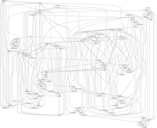
好花阿~跟想像中完全不一樣。
雖然知道一些 graphviz 排版技巧,但面對這麼複雜的圖,完全沒有頭緒從何排版起。
上了 graphviz 查了一下,原來有多種不同的 layout 方式可以使用。預設是標準的 dot layout
dot - ``hierarchical'' or layered drawings of directed graphs. The layout algorithm aims edges in the same direction (top to bottom, or left to right) and then attempts to avoid edge crossings and reduce edge length.
以下是使用不同 layout 產生的圖:
neato - ``spring model'' layouts. Neato attempts to minimize a global energy function, which is equivalent to statistical multi-dimensional scaling. The solution is achieved using stress majorization, though the older Kamada-Kawai algorithm, using steepest descent, is also available. fdp implements the Fruchterman-Reingold heuristic including a multigrid solver that handles larger graphs and clustered undirected graphs.
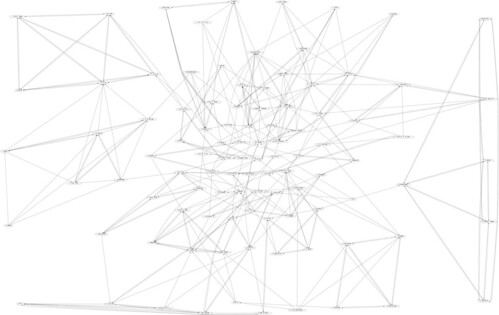
fdp - ``spring model'' layouts similar to those of neato, but does this by reducing forces rather than working with energy. Fdp implements the Fruchterman-Reingold heuristic including a multigrid solver that handles larger graphs and clustered undirected graphs.
sfdp - multiscale version of fdp for the layout of large graphs.
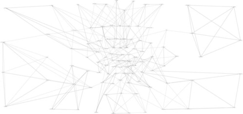
twopi - radial layouts, after Graham Wills 97. The nodes are placed on concentric circles depending their distance from a given root node.
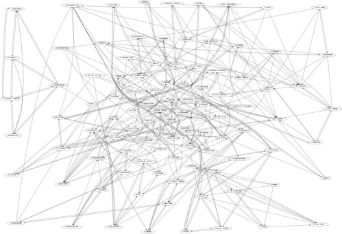
至於我心中最理想的 circo layout algorithm 則跑不出結果,可能太複雜了吧。XD
circo - circular layout, after Six and Tollis 99, Kauffman and Wiese 02. This is suitable for certain diagrams of multiple cyclic structures such as certain telecommunications networks.
由結果可見 neato, sdfp, twopi 都有中心區塊較複雜、邊緣較簡單的情況,尤其以 twopi 更明顯,關連最多的點幾乎都在中心區塊了。而本圖的『群組』特性,則是 dot, sdfp 呈現的比較清楚,相關的 node 幾乎會在附近自成一圈。
這個 special case 還挺好玩的,graphviz 要深入摸索也還有很多有趣的點子。
真佩服這樣的 open source project,總帶來許多創意跟活力。
一想到共有100 nodes,400 edges,直覺就是拿 graphviz 來產生,否則要一一畫點連線,我會瘋掉~
by using raw editing, replacement text editor tips, the dot file was be written in the short time.
http://freetexthost.com/sjcxlh4ew1
這個dot檔有幾個特性:
1. 共有 100 個 node
2. 每個 node 會指向其他四個 node, 所以共有 400 條 edge
3. 相連的 node 相關性較高。所以可能有幾個 node 彼此相連,而不和其他 node 相關連的情況
透過 graphviz 畫出來的圖如下:

好花阿~跟想像中完全不一樣。
雖然知道一些 graphviz 排版技巧,但面對這麼複雜的圖,完全沒有頭緒從何排版起。
上了 graphviz 查了一下,原來有多種不同的 layout 方式可以使用。預設是標準的 dot layout
dot - ``hierarchical'' or layered drawings of directed graphs. The layout algorithm aims edges in the same direction (top to bottom, or left to right) and then attempts to avoid edge crossings and reduce edge length.
以下是使用不同 layout 產生的圖:
neato - ``spring model'' layouts. Neato attempts to minimize a global energy function, which is equivalent to statistical multi-dimensional scaling. The solution is achieved using stress majorization, though the older Kamada-Kawai algorithm, using steepest descent, is also available. fdp implements the Fruchterman-Reingold heuristic including a multigrid solver that handles larger graphs and clustered undirected graphs.

fdp - ``spring model'' layouts similar to those of neato, but does this by reducing forces rather than working with energy. Fdp implements the Fruchterman-Reingold heuristic including a multigrid solver that handles larger graphs and clustered undirected graphs.
sfdp - multiscale version of fdp for the layout of large graphs.

twopi - radial layouts, after Graham Wills 97. The nodes are placed on concentric circles depending their distance from a given root node.

至於我心中最理想的 circo layout algorithm 則跑不出結果,可能太複雜了吧。XD
circo - circular layout, after Six and Tollis 99, Kauffman and Wiese 02. This is suitable for certain diagrams of multiple cyclic structures such as certain telecommunications networks.
由結果可見 neato, sdfp, twopi 都有中心區塊較複雜、邊緣較簡單的情況,尤其以 twopi 更明顯,關連最多的點幾乎都在中心區塊了。而本圖的『群組』特性,則是 dot, sdfp 呈現的比較清楚,相關的 node 幾乎會在附近自成一圈。
這個 special case 還挺好玩的,graphviz 要深入摸索也還有很多有趣的點子。
真佩服這樣的 open source project,總帶來許多創意跟活力。